Edible branding that actually gets remembered: adapting gingerbread design to different industries
Why edible branding works for British businesses
Imagine a client meeting where, instead of another printed brochure, you place a small iced biscuit on the table that looks exactly like the client’s logo. It is familiar, playful and just a little unexpected. Edible branding works because it taps into emotion and memory, not just logic. People might forget a leaflet, but they rarely forget a biscuit that made them smile.
For companies in Manchester and across the UK, customised gingerbread has become a quiet, but very effective communication tool. It can soften a serious conversation, make a training session feel more human, or turn a standard “thank you for your order” into something genuinely warm. Many local brands already commission branded gingerbread gifts in Manchester instead of the usual pens, mugs or keyrings, because a sweet, carefully designed biscuit feels more personal than another plastic object.
Food is also strongly tied to culture and tradition in Britain. From office tea breaks to festive buffets, there is always space for a small treat. When that treat reflects the company’s colours, tone of voice and values, it becomes a tiny, edible version of the brand itself. The key is to adapt the design thoughtfully for each industry, not to copy one template for everyone.
Translating brand guidelines into gingerbread design
Colour, icing and recognisable palettes
The first step is colour. Icing does not always behave like a screen or a printed brochure, so bright digital shades need to be adjusted. A bold electric blue might become a slightly softer navy, and neon green might shift towards a fresh mint shade. The important thing is that, when a client sees the biscuit next to your printed materials or website on a tablet, they feel that everything belongs to the same family.
For a financial firm, cool blues, greys and understated metallic details often feel appropriate. A children’s brand might choose gentle pastels with small pops of brighter colour. A tech company could add graphical lines or geometric shapes that echo its app interface or data visualisations. The palette should come from the existing brand, not from a random Pinterest moodboard.
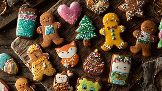
Shape, silhouette and industry associations
Shape is where you can respond to each sector in a playful way. A property developer might choose little house outlines or stylised city skylines. A clinic could use rounded, comforting shapes that suggest care and softness instead of harsh angles. A sports brand may prefer dynamic silhouettes that feel energetic.
Small details matter. Not every logo works as a direct cookie cut out, especially if it has tiny text or very thin lines. A good artisan will simplify the mark, maybe keeping just the initials or a recognisable icon. The aim is for the biscuit to be instantly recognisable from a distance, not only when someone holds it right under a lamp.
Words, messages and packaging
Many British brands underestimate the power of a short message on the icing or packaging. Two or three words can completely change how the gingerbread is perceived. “Thank you for your trust” will feel different from “Welcome to the team” or “Cheers to your big day”.
To keep the look clean, the biscuit itself can carry the logo, while the individual envelope or box includes a short line in the company tone of voice. For professional services, that may be calm and reassuring. For an indie café, it could be cheeky and informal. Packaging is part of the design, not just a protective layer.
Practical questions to ask before approving a design
Before you sign off the first batch, it helps to treat edible branding as seriously as any other brand touchpoint. You can use a simple checklist:
- Does the colour of the icing feel close enough to our existing palette when seen in natural daylight
- Is the logo still recognisable at arm’s length, not only in a close up photo
- Would someone who has never heard of our company guess roughly what we do from the biscuit design
- Does the packaging match our usual materials and tone of voice
- Would our team genuinely feel proud to hand these out to clients, partners or staff
These questions sound simple, but they quickly show whether the design is aligned with the brand or just “cute”.
Adapting gingerbread to very different sectors
Different industries expect different moods. The same biscuit shape and colour will not suit a law firm, a yoga studio and a gaming company. Carefully adapting the style helps you show respect for each audience.
Professional services and finance
In banking, legal services or insurance, clients often look for stability and trust. Here, gingerbread design should be elegant and restrained. Think clean outlines, limited colours and subtle metallic accents rather than bright confetti. Instead of jokes on the icing, a quiet “thank you” on the packaging may be enough.
When a Manchester based law practice sends biscuits to mark the completion of a big deal, they might choose a classic rectangular shape, their simplified logo and a short printed note with the transaction name. The gesture is warm, but still feels professional and serious.
Hospitality, cafés and hotels
Restaurants, cafés and hotels have more freedom to experiment. A boutique hotel in the Northern Quarter may play with architectural motifs from its building, while a family friendly café might turn its signature latte art into a gingerbread pattern. Seasonal editions can link to local events, like football matches, festivals or Christmas markets.
Hospitality teams also use edible branding internally. New staff induction days, menu tastings or press events all become more memorable with a tray of customised biscuits on the table. It shows care for detail and a sense of hosting that goes beyond the obvious.
Healthcare, education and wellbeing
For clinics, therapists and educational providers, the main priority is reassurance. Soft colours, rounded shapes and gentle messages work better than loud slogans. A children’s speech therapy centre, for example, might commission character shaped biscuits that match the illustrations in its workbooks. A university department could use shield shapes in its colours, with faculty initials written by hand.
These designs help reduce anxiety. A child arriving at a clinic in Salford and being offered a biscuit with a friendly character they recognise from the website feels that the place is consistent and welcoming. It is a small touch, but it can change the emotional tone of the visit.
Internal culture, workshops and team building
Gingerbread is also powerful for internal branding. Manchester companies often organise away days, strategy sessions or creative workshops where people need a relaxed atmosphere to share ideas. A carefully planned Gingerbread Decorating Workshop gives staff a chance to play with brand colours, symbols and messages by hand, not just on slides.
In these sessions, people often come up with fresh visual ideas that later inspire social media campaigns or office murals. The biscuits from the workshop can be photographed and shared on internal channels, reinforcing a sense of identity and pride.
Turning feedback into better designs
After events, it is worth collecting informal comments from clients and colleagues. Which shapes were picked first from the tray. Which colours looked best in photos. Did anyone take a biscuit home in their bag because it was “too nice to eat”. This feedback helps refine the next batch and shows which aspects of the design really resonate.
From gingerbread to cakes – building a coherent sweet identity
Once a business has found a visual language that works on biscuits, it makes sense to extend it to other sweet formats. Celebration cakes, dessert tables and small individual treats can all follow the same cues, so that every event feels like part of the same story.
For example, a creative agency might welcome new clients with a box of logo biscuits during the first meeting, then mark the launch of the campaign with a larger cake that uses the same shapes and colours. A training provider could hand out gingerbread at small workshops, and bring in a more elaborate centrepiece for an annual conference. When these elements feel connected, they support the brand instead of competing with it.
In Manchester, many companies already experiment with this layered approach. A tech firm hosting a product demo at a city centre venue might combine mini biscuits shaped like icons from its app with branded cakes in Manchester that echo the interface layout. Guests encounter the same visual language on screens, printed materials and on the dessert table, which strengthens recall long after the event.
Keeping taste and quality at the heart of every decision
Even the most beautiful design will fail if the biscuit does not taste good. British customers are increasingly interested in provenance, natural flavourings and shorter ingredient lists. That is why collaboration between the brand team and the artisan baker is essential. Spices, textures and aromas must match the brand personality as carefully as colours and shapes.
A wellness company might prefer a lighter spice blend and more delicate sweetness. A traditional pub chain could lean into rich, nostalgic flavours that remind people of winter evenings and family celebrations. Taste is part of the brand story, not an afterthought.
Measuring impact beyond likes and photos
It can be tempting to measure the success of edible branding only by social media engagement, but there are other useful signals. Sales teams can track whether clients mention the biscuits in follow up conversations. HR can note whether staff bring family members to open days because “they loved the treats last time”. Marketing teams can observe how often people share photos of the table, not just the stage or speakers.
Over time, these small pieces of evidence add up. They show that thoughtful, industry specific gingerbread and cakes are doing what good branding should do: making the company feel more human, more consistent and more memorable in the everyday life of its community.
