Minimalist cake design: why “less” now reads as luxury across England
A quiet trend with a loud impact
Minimalism has been creeping into British celebrations for a while, but lately it feels like the default choice rather than the “brave option”. You see it at registry-office weddings in London, at cosy birthday dinners in the North West, and even at corporate launches where the cake is photographed almost as much as the product. The shift makes sense: when everything else in life is noisy, a calm centrepiece feels like a small exhale.
A minimalist cake is not a plain cake. It is a considered one. The decoration is edited, the finish is intentional, and the design leaves space for the room, the flowers, the table linen, and the people.
And yes, it can still feel personal. In fact, minimalism often makes the “personal” clearer because nothing distracts from it.
What “minimalist” actually means to your client
People say “minimalist” when they mean different things, so it helps to translate the vibe before you talk details.
Some clients mean “clean and modern” – sharp edges, smooth buttercream, neutral tones, a single statement element. Others mean “soft and natural” – gentle textures, earthy colours, imperfect elegance, like a cake that belongs in a countryside kitchen. There is also the “gallery look” – stark white, lots of negative space, one sculptural flourish that looks like it could be in Tate Modern.
In England, you’ll also notice a practical driver: smaller gatherings. When a celebration is intimate, guests sit closer, look longer, and notice finesse. That’s where restraint wins.
Early on, it helps to anchor the design in something that feels honest and simple, including flavour choices and ingredients. A minimal style pairs naturally with a “clean label” approach, where you can confidently say the cake is made with real butter, proper vanilla, and careful sourcing. The same thinking carries into companion treats too – a neat box of natural ingredients gingerbread can echo the same pared-back philosophy without competing with the cake.
Colour choices that read expensive without shouting
Minimalist cakes tend to live in a narrow palette, but that does not mean they are colourless. The goal is harmony, not emptiness.
In British homes and venues, lighting changes everything. Warm pub lighting in December makes creams look golden. Bright window light in a summer marquee can turn pale pink into nearly white. That’s why a minimalist palette often works best when it has subtle contrast: ivory against soft oat, stone against warm grey, blush against off-white.
A small trick that changes the whole look
Choose one “hero neutral” and one supporting shade, then repeat them with discipline. If the cake is ivory, keep the ribbon, the stand, and even the candle colour in the same family. If you add metallic, pick one finish only – brushed gold or matte silver, not both. That consistency is what people read as “designer”.
Texture does the work when decoration steps back
When you remove obvious ornaments, the surface becomes the star. That is where minimalism either looks breathtaking or unfinished.
Think about textures that photograph well in England’s soft daylight: velvet-smooth buttercream, crisp sharp edges, delicate palette-knife strokes that feel intentional rather than messy, or a thin glaze that catches light without looking glossy.
Here are practical, client-friendly ways to keep a minimalist cake interesting without clutter:
- Choose one strong finish: perfectly smooth buttercream, a controlled textured swipe, or a sleek ganache coat.
- Use a single statement detail: one sugar flower, one wafer-paper sail, or one hand-painted line.
- Keep the top clean: a bare centre with decoration placed off to one side feels modern and confident.
- Limit the colour count: two tones plus white usually feels refined and calm.
- Add quiet structure: a subtle ridge, a soft corner, or a thin band can replace heavy ornament.
- Let flavour guide the style: lemon and elderflower suits airy minimalism, while chocolate and espresso leans more architectural.
- Think about scale: a smaller cake on a taller stand often looks more premium than a larger cake covered in extras.
- Match the venue mood: city loft equals crisp lines, country barn equals softer textures and warmer tones.
Minimal does not mean impersonal
The worry you will hear is, “Will it look too plain?” That’s your moment to reframe the idea. Minimalism is not about removing meaning. It is about choosing where the meaning lives.
Instead of adding five decorations, you add one that matters. A single monogram. One date piped in a fine line. A colour that references a favourite jacket, a family tartan, or the paint on the walls of their first flat. In Manchester, for example, you might see minimalist cakes requested for modern warehouse venues where the couple want the cake to feel like part of the architecture, not a separate prop.
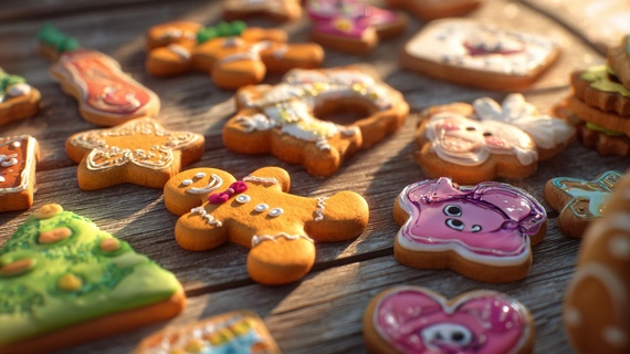
Where gingerbread can support the story
If the client wants something playful, you can keep the cake calm and let the extras carry the personality. A few slim, elegant biscuits can do that beautifully – especially when they’re kept in the same palette as the cake. Done with restraint, custom decorated gingerbread can act like place cards, tiny menu accents, or a subtle nod to a theme, while the cake remains the clean focal point.
Staging matters as much as icing
Minimalist cakes are unforgiving in the best way. They reveal their quality immediately, and they look stunning when styled thoughtfully.
In England, the table setup often includes mixed elements – flowers from a local florist, hired glassware, candles, seasonal greenery. A minimalist cake needs breathing room. Give it a simple stand, avoid busy cake tables, and keep signage small. If the cake is near a window, angle it so the light hits the texture and does not flatten it.
A note on weather and delivery
British weather loves to surprise you. Humidity, cold-to-warm transitions, and condensation can all affect a smooth finish. Minimalist designs benefit from good planning: stable temperatures, sensible timing, and packaging that protects edges. This is where “simple” is not “easy” – it’s skilled.
How to brief a baker when the design is pared back
Minimalism goes wrong when the brief is vague. A client might say “simple” and show five different styles: rustic, modern, vintage, and cartoonish. Your job is to help them edit kindly.
Ask for three reference images and then discuss what they like in each one. Is it the shape, the colour, the texture, or the mood? Once you identify the pattern, the design becomes straightforward.
Here’s a short checklist you can use during the conversation:
- What is the venue style – modern, classic, rural, industrial?
- Which two colours must be present, if any?
- Do they prefer sharp edges or softer, more natural lines?
- Should the cake look calm, playful, romantic, or bold?
- Will there be companion treats on the table, or should the cake stand alone?
- How important is photography, and where will the cake sit in the room?
- Are there ingredient preferences that matter to them?
When a client wants a minimalist look, they are often choosing a premium feel without saying the word “premium”. They may have seen friends order elaborate designs and now want something that feels grown-up, current, and quietly confident. It’s also why many people searching for custom decorated cakes are really looking for an expert who can make simplicity look intentional, not accidental.
A final thought: minimalism is a compliment to the person
For someone who loves minimalism, an over-designed cake can feel like being spoken to in the wrong language. A clean, thoughtful design says, “I see your taste.” It respects their style, it fits the room, and it leaves space for the celebration itself.
When the details are right, guests notice. They lean in. They ask who made it. And the cake becomes memorable not because it was loud, but because it was perfectly judged.