Sweet styling that sells: practical ways to make your bakes shine on camera
Why styling matters more than ever
Great photos do more than look pretty - they help customers taste with their eyes. In England, where independent makers compete with high street brands and platforms move fast, a clear styling plan turns one shoot into a week of posts, ads, and stories. Whether you work from a home kitchen in Salford or rent a day in a studio near the Northern Quarter, you can shape light, colour, and composition to tell a story customers remember. If your hero product is custom decorated gingerbread in Manchester, the goal is simple - show craft, clarity, and warmth without clutter.
Start with the brief, not the backdrop
Before you reach for ribbons and props, write a mini-brief. Who is the photo for - couples choosing favours, HR teams planning gifts, or families looking for weekend treats. What do you want viewers to do - tap to buy, enquire about a set, or save the idea for later. Choose one message and let every styling choice serve it.
Decide the story
Pick one core feeling and stick to it. Cosy winter comfort, fresh spring brightness, or clean corporate gifting. If your designs are intricate, keep backgrounds calm. If your shapes are simple, let a bolder cloth or tiled surface add rhythm.
Match format to platform
Ads prefer clean margins and space for copy. Reels lean on motion and reveals. Pinterest loves top-down grids. Square works well for marketplaces, but 4:5 often wins reach on Instagram. Plan a shot list that covers both hero frames and crops for vertical use.
Light that flatters icing and crumb
Light is your best styling tool. Natural window light from a north-facing room gives soft detail all day. On cloudy Manchester afternoons, a single softbox with a diffuser keeps colours true. Place the light at 45 degrees for texture on royal icing, then add a white card opposite to lift shadows. If biscuits look flat, backlight gently to make edges glow. Keep consistency across a set so the carousel feels coherent.
Backgrounds and surfaces that never fight the bake
Wood boards, painted MDF, linen, matte tiles - they all behave differently under light. Gloss can cause hot spots on glaze. Coarse fabric traps crumbs and makes small items look messy. Mid-tone greys and warm stone flatter both dark gingerbread and pale buttercream. Tape a metre of neutral backdrop paper to a table and you have an instant studio you can roll away after service.
Composition that sells the detail
Use the rule of thirds to place the hero and leave space for text overlays. Lead the eye with diagonals - a ribbon, a piping bag, or stacked boxes. For sets, repeat shapes in odd numbers so the scene feels natural. Get closer than you think - customers want to see sugar sparkle and piping ridges.
A quick on-set checklist
- Wipe edges and tidy crumbs that don’t serve the story
- Rotate pieces so the most expressive icing faces camera
- Lift the hero on a small riser for shadow separation
- Use tweezers for tiny sprinkles to avoid greasy fingerprints
- Keep steam and glare off chocolate with cooler rooms
- Shoot a clean plate with no props for design flexibility later
Colour, props, and brand memory
Colours carry meaning. Soft blues feel calm, greens feel fresh, reds feel festive. If your boxes are kraft, echo that brown in a linen or ceramic to tie the set together. Props should whisper context - a tea cup for afternoon sets, a name tag for favours, a ribbon from your actual packaging. Branded cards belong in the scene only when they don’t steal focus. Less is more - two or three props are usually enough.
Texture is the secret sauce
Pair crunchy biscuit with soft cloth, smooth icing with rough stone. Texture contrast keeps viewers interested even in simple compositions. For icing shine, a tiny mist of water on nearby props can add life, but never spray the biscuit itself.
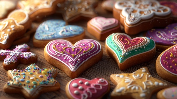
Gingerbread that feels hand-touched
Iced biscuits read best in three angles - top-down for pattern clarity, 45 degrees for depth, and side-on for thickness. If your sets include names or dates, shoot a version with a blank plaque for flexible mockups. Behind-the-scenes frames raise trust - a hand holding a brush, a tray coming out of the oven, or a piping bag mid-swoop. If you teach or host a Gingerbread Decorating Workshop, stage a table with tools neatly aligned, neutral aprons, and bowls that match your palette. The message is care and craft, not mess.
Practical tips most makers overlook
- Keep a printed shot list and tick it off to avoid missing banner crops
- Label trays A, B, C so the same biscuit follows through each angle
- Bring a spare un-iced blank for text overlays in ads
- Pack a mini repair kit - royal icing, toothpicks, cotton buds, alcohol wipes
- Use museum putty to stop biscuits rolling on curved props
- Track what performs - save posts with the best saves and replicate lighting next time
Motion that multiplies your set
Short loops of sugar dusting, icing dots appearing in a line, or a ribbon pull create thumb-stopping clips. Build motion from stills - three frames is enough for a subtle carousel rhythm. Keep music calm for luxury sets and playful for seasonal ones.
From biscuits to showpiece cakes
Cakes ask for different tactics. Tall layers need breathing room above the top edge, so shoot slightly lower and further back. Buttercream texture loves side light. Glossy ganache prefers controlled reflections - flag off stray light with black card. Slices sell - show interior layers on a clean plate with a small gap between crumbs so it looks intentional, not accidental.
Elevate the hero without overdoing it
A cake turntable under the tablecloth can lift height for a stronger silhouette. Knife marks should be deliberate - wipe between cuts. If you photograph in city venues, bring a stable board so the cake doesn’t sink into soft linens. When showcasing portfolio work like bespoke cakes in Manchester, pair the showpiece with a single, subtle prop that hints at the client context - a mini bouquet for a florist partnership, a satin tie for a corporate order.
A local case to learn from
A small maker in Ancoats prepared a winter gifting campaign. The plan included one hero grid of iced snowflake biscuits, a warm top-down tea scene for lifestyle, and a five-frame sequence of piping close-ups. Light came from a single window with a reflector. Surfaces were a grey stone slab and a folded wool scarf. The brand card appeared only once in the carousel. Result - higher saves, a lower cost per click on ads, and enquiries from two offices looking for team gifts.
Styling with care, community, and continuity
The best sets feel like you. Keep a palette and prop box that match your brand. Shoot a test frame before every new angle. Build a folder of repeatable lighting setups so November shoots match July energy even on darker days. When the story is clear and the scene is tidy, customers feel the care you put into every biscuit and cake, and the community responds with shares, comments, and orders.
Two simple lists to pin on your studio wall
- Prep list for every shoot
- Mini brief with audience and action
- Shot list with platform crops
- Clean, mid-tone surfaces and two props
- Light plan - window or softbox plus reflector
- Repair kit, tweezers, wipes, spare blanks
- Consistent colour notes for editing later
- Quality checks before you pack down
- Zoom to 100 percent - icing edges sharp, no stray crumbs
- Consistent white balance across the set
- Space for ad copy in at least two frames
- One lifestyle, one product-pure, one motion clip
- Backup to two places - card and cloud
- Quick notes on what worked to repeat next time
Keep it human
Your customers buy the feeling of a good gift - care, time, and taste. Let your photos show that. A steady approach and small improvements each month will compound into a recognisable visual style that carries you through seasons and campaigns.